Udemy course @ 90% discount - on this Christmas, 2021

Course: Comprehensive Data visualization with Matplotlib in Python

Validity: Lifetime

Offer-Duration: [ 25 Dec – 30 Dec, 2021 ]

Direct link with coupon code

Coupon Code

BESTOF2021XMAS

Table of Contents

About

I am sure that you would have heard of Matplotlib quite often if you are from data analysis, data visualization or a related domain. If NOT, then no worry, then you will understand it in this section. Matplotlib is a comprehensive library for creating static, animated as well as interactive visualization in Python. It is one of the best and most used libraries for plotting in 2D and 3D. Matplotlib is a third-party library (or module) developed to work with Python. It does not come with the standard Python installation package, need to be installed separately. Matplotlib with Python, makes scientific plotting simple & straight forward.

Data visualization

Data visualization is an art of representing one or more collections of numerical (or text) data into a graphical format. There are plenty of ways to represent the data and it purely depends on the type of data as well as an individual’s intent to view the data. Several visualization choices are available as far as visualizing the data is concerned such as XY plot, Scatter plot, Bar chart, Stacked bar chart, Pie chart and so on. Depending on the type of data, it can be visualized in 2-Dimensional as well as in 3-Dimensional space.

Talking about Matplotlib, it facilitates the plotting of almost any kind of data available at present. You will understand more on the Matplotlib library in the subsequent section of this page.

data visualization using matplotlib in python
data source

Data source

In today’s world, data is obtained from a plethora of sources. Listing out every source of data is not possible at any point, although some of the prominent sources are Stock market, Sales, production, Web scraping, IoT, Automation, Sensors, Natural occurrence, Survey, Demographic and countless other. All of these sources contribute to a humongous data.

Predominantly, the source generates data either in manual mode or automated mode. It would be practically impossible to even list out the broad categories of data source, but still, I assume you could understand.

Need to visualize data

We do Data visualizations with an intention to get meaningful information as well as the key insights. As you have learned, there are a plethora of sources to collect data. As more and more data is being generated every day, it requires to be processed to get meaningful information, which I am sure can’t be perceived directly from the raw data. Therefore, we need to visualize the data. Sometimes, instead of visualizing the complete data, we visualize (or plot) only statistics of the data.

Visualization also helps an organization or even an Individual to make data-driven decisions. Further, the advantages of visualizing the data are listed below,

  • Visualization enables us to make Data-driven decision.
  • A pattern or future Trend can be predicted
  • The goal is to communicate information clearly & efficiently
  • Communicate the relationship among the data
need for data visualization

What is Matplotlib

The Matplotlib can visualize the data through various kind of graphs and plots. To convey meaningful information, one needs some kind of pictorial representation of the true data and Matplotlib can help us a way forward by providing an extensive set of functionalities. Matplotlib helps to know more insight and the correlation among the data. 

It’s already proven fact, backed by a lot of experimental stats, that human can understand visuals better than any other form of information. Matplotlib provides an extensive set of tools to plot & visualize data in various formats such as continuous distribution plot, scatter plot, pie chart, histogram, Images and various other 2-dimensional formats. Matplotlib does not restrict itself to 2D plot but also extends it supports to plot & visualize in 3-Dimensional space, Images as well as Audio.

Matplotlib features

pyplot in matplotlib

Matplotlib has powerful module named Pyplot

Matplotlib contains several plotting and charting tools to plot data on multiple ways. All these powerful function falls under the hood of PYPLOT.

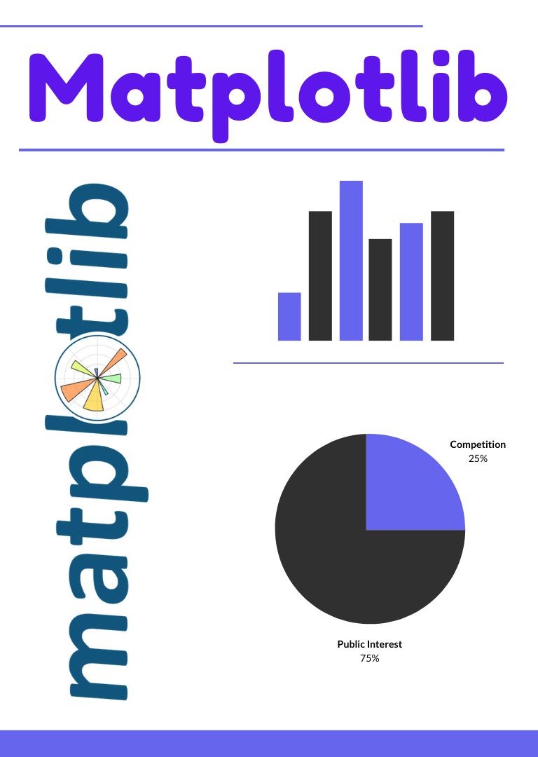
Support various charts & plots

Matplotlib has many graphical way of representing the data such as XY plot, scatter plot, histogram, bar chart, stacked bar plot, pie chart and so on

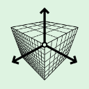
Extends it supports to plot & visualize in 3 Dimension

Matplotlib does not restricts itself only to 2-Dimensional space but it also extends it support to plot and visualize data in 3-Dimensional space.

Audio data can also be visualized in Matplotlib

Audio data can also be visualized in Matplotlib along with Numpy modules to process the numerical information in Python.

cutsomize plot

All the customization option are available for the plot

Matplotlib has many customization option that can be applied on plots such a label, title, legends, markers, line style, color and many more
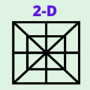
Support 2D plotting

Matplotlib supports all kind of 2-Dimensional plotting. All kind of linear and non-linear plotting are feasible with this third party module.

Supports Image visualization & colouring scheme

Apart from 2D & 3D data visualization,Matplotlib also support visualizing Image and applying few coloring scheme. It support only PNG format natively.

Provide option to save chart & plot in Multiple formats

Matplotlib has inbuilt functionality to save the generated plot in various format such as PNG and PDF. Any type of plot can be saved in this scheme.

Learning Resources

eBOOK

coming soon

Scroll to Top