
Matplotlib in Python is one of the most popular and powerful libraries for data visualization. It offers varieties of pre-built functions that can handle plotting data in pretty well. It offers a wide range of plotting options such as Scatter plot, Bar chart, Pie chart, XY plot, stacked plot, 3D plot and several others. It is a third-party library which needs to be installed separately. Matplotlib can be used for linear as well non-linear plotting and it extends its supports beyond 2D.

Table of contents
- Introduction to Matplotlib
- Install and Import Matplotlib
- Pyplot in Matplotlib
- Python matplotlib example
- Various Matplotlib plot
- More plot option in Matplotlib
- Handling Time series data in Matplotlib
- Audio analysis in Matplotlib
- Working with Images in Matplotlib
- Conclusion
- Learning Resources
Introduction to Matplotlib
You must have heard that “Data is the new Oil or Data is new Electricity” in the 21st century. Tons of data are being generated each day from a plethora of sources. To get meaningful information, co-relation, statistics, future trends from these data, it needs to be visualized first. Data visualization is a key and essential part of almost all modern-day task.
In today’s world, we have a humongous amount of data from a plethora of sources. Once we have all these data available, we need to get meaningful information out it. To get meaningful information, data analysis is required. Matplotlib comes handy to visualize the data. The Matplotlib can visualise the data through various kind of graphs and plots.
To convey meaningful information, one needs some kind of pictorial representation of the true data and Matplotlib can help us a way forward by providing an extensive set of functionalities. Matplotlib helps to know more insight and the correlation among the data.
It’s already proven fact, backed by a lot of experimental stats, that human can understand visuals better than any other form of information. Matplotlib provides an extensive set of tools to plot data in various formats such as continuous distribution plot, scatter plot, pie chart, histogram, Images, 3D plots and much more.
PDF version of Jupyter Notebook file is also attached, which contains the code and the output for all the topic that has been discussed in this Tutorial. Go ahead and download it for your reference. The download link of the file is available at the bottom of this page.
Install & Import Matplotlib
In this section, you will learn how to install matplotlib in Python using PIP as well as import it in the Python program. It is going to be a pretty smooth tutorial and you will learn a lot from here.
Python-matplotlib install
You can install matplotlib in python with the help of PIP (Python package manager). There are certain dependencies for Matplotlib such as Numpy, dateutil, kiwsolver , cycler, setuptools and pyparsing. These modules are necessary for the functioning of Matplotlib. The latest version, at any point of time, of Matplotlib, can be found at matplotlib pypi.
You will learn to install matplotlib and understand how the dependencies automatically get installed with the help of requirements.text file. Although we don’t have to install all the dependencies as matplotlib takes care of everything by installing all those dependencies in the background. The code snippet for the installation is shown below,
pip install matplotlib
Import matplotlib in Python
After installation, matplotlib can be imported in Python as shown below
import matplotlibBut in the actual code, you will see something different, as shown below
from matplotlib import pyplot as plt
                OR
import matplotlib.pyplot as plt
In the above code, we are importing pyplot (you will learn in the subsequent section), one the most essential asset, from matplotlib. Also, you will notice that we are using the term “plt”. Plt is just an alias name given to matplotlib.pyplot and it could be anything as per your wish, but this is the most convenient term used by almost every Pythonistas.
The alias name is helpful to access every method with this (plt) particular short name. With the help of alias name, you can write plt.plot() instead of matplotlib.pyplot.plot ().
Don’t bother, you will observe plenty of examples in this space.
Pyplot in Matplotlib
Pyplot is an integral part of the matplotlib library, focused on creating plots. Pyplot is the collection of several functions each targeting a specific component. The functionalities of pyplot are inspired by MATLAB, so in case if you don’t know, MATLAB is one of the best mathematical computing tools out there in the industry. The full form of MATLAB is MATrix-LABoratory. Each pyplot function makes some changes to figure or plot such as creating a figure itself, creating a plot area, adding data and so on.
pyplot can be imported in Python using the syntax shown earlier, which is
from matplotlib import pypot as pltPython matplotlib example
Now, its time to include some example that will help you to get started with matplotlib.
I am going to create a simple plot using predefined data.
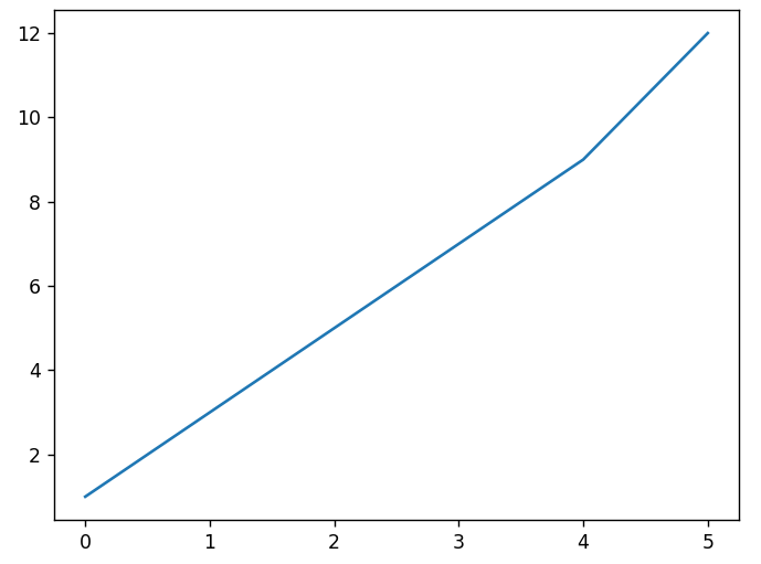
import matplotlib.pyplot as plt
y_data = [1, 3, 5, 7, 9, 12]
plt.plot(y_data)
plt.show()
As you can see the output plot, generated by pyplot, the x-axis is defined automatically based on the provided data. If you provide one-dimensional data (as in this case), the x-axis gets populated by default and it will take care of the range automatically.
However, you can also specify a fixed x-axis range. Make sure that the length of the x-axis and y-axis range should be same, otherwise it will throw the error. Defining x-axis & y-axis is matplotlib is shown below,
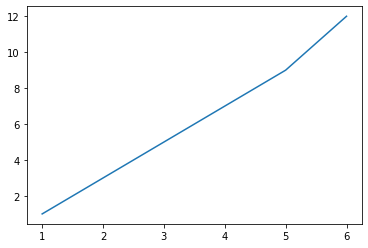
import matplotlib.pyplot as plt
y_data = [1, 3, 5, 7, 9, 12]
x_data = [1,2,3,4,5,6]
plt.plot(x_data, y_data)
plt.show()
Various Matplotlib plot
Matplotlib library supports a variety of graph and charts for data visualization in Python. It’s a fact that “One plot does not fit into every requirement”. In this section, you will learn some of the generals yet most frequently used plots. So here we go !!
XY Plot in Matplotlib
This is perhaps the most common type of plot for representing the relationship between two data series. The simplest example of the XY plot has already been shown in the previous section. A couple of data points were there in both x_data and y_data, and they are plotted on an XY plot. A linear or non-linear relationship can be visualized in this type of 2D plot.
Scatter Plot in Matplotlib
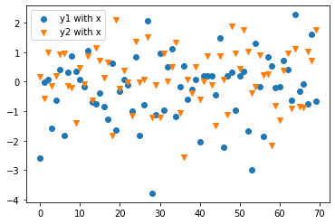
I am sure you have come across the term scatterplot right, it is the data points shown in two-dimensional space bounded by some X and Y range. It is also possible to plot the data in N-dimensional space. The data points in the scatter plot are not connected via any lines or something so they are spread or scattered across that space. The best example to visualise a scatter plot is STARS in the sky. Every star appears to be placed randomly throughout the visible space.
Customizing plot in Matplotlib
Apart from plotting and visualizing data on any type of plot, you can customize to show legends, labels, grids, titles, markers and various line style. These are the essential components of any plot and helps the user to understand the components clearly & effectively. Without a label, the user doesn’t know about what exactly is in the x-axis and what exactly in the y-axis. The title is the top heading which says about the plot (in a simple sense it is the name of the plot) and legends represent the components of a graph. A full-fledged plot with all possible customization is here.
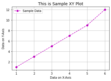
import matplotlib.pyplot as plt
data = [1, 3, 5, 7, 9, 12]
x_data = [1,2,3,4,5,6]
plt.plot(x_data, data, 'o--m',label='Sample Data')
plt.xlabel("Data on X-Axis")
plt.ylabel("Data on Y-Axis")
plt.legend(loc='best')
plt.title ("This is Sample XY Plot", fontsize=14)
plt.grid(True)
plt.show()
More plots in Matplotlib library
Matplotlib is probably one of the most advanced data visualisation tools available right now. The main intention of this lesson is to provide you with more visualisation via various other plots such as Histogram, bar charts, stacked bar chart and Pie chart. All of these plots help you to get more understanding of data as well get better insight about the data. As you already know that one plot doesn’t fit into every requirement therefor understanding of multiple plots is necessary.
Histogram in Matplotlib
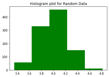
I assume that you would have some knowledge about the histogram, even if you don’t have, it not stops you from learning the concept. Although histogram looks similar to a bar plot (or a bar chart) it’s not the same. Bars in the histogram are touching each other side by side to cover the entire range without missing even the single value. The histogram represents the number of times the value between a particular range has occurred and are plotted as one bar for that range.
Pie Chart in Matplotlib
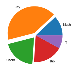
Pie Charts are pretty charming, especially I feel this way. It is used as one of the fascinating ways of projecting the data with the help of labels and numbers with a circle having segmented coloured section. One of the important things to keep in mind about pie chart is that sum of numbers to be plotted on a pie chart should be 100 (hundred), which makes the representation easy otherwise you have to manually apply some method and tricks to compensate the gap. We will see the various options that can be applied to a pie chart using the Matplotlib library.
Stacked Bar Chart in Matplotlib
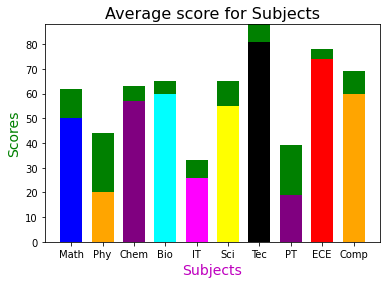
To understand the stacked bar chart easily, I had used a very interesting example from our school days. Do you remember sometimes we use to get grace marks (not to pass but) because of one or more questions were wrong or out of syllabus? I’ll be using a stacked bar chart to display those Grace marks stacked on top of the actual marks obtained by the students. Further, we can apply various properties such as change the colour of the stacked potion or the actual base bar of plot in matplotlib.
Plotting and visualizing data in 3-D
Apart from plotting the linear and nonlinear data in 2D plot Matplotlib is also capable of displaying data on a 3D plots using surface plot. Various modules and function of Matplotlib can handle 3D data pretty well. We need 3-axis, for visualising 3-dimensional data which is X, Y and Z. With the combination of these three access, we can plot a three-dimensional data using matplotlib.
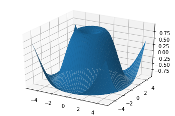
It’s fact that the human brain perceives 3-dimensional data better than any other form of data because we live in an environment where height, width and depth are an integral part of visual dimension. For us, visualising beyond three-dimensional challenging and I am not even going to discuss here. A sample 3D surface plot is shown here
Handling Time series data in Matplotlib
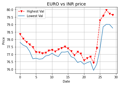
Time series data is continuous data sequence associated with some kind of timestamp such as year, month, day, hours, minute, second as well as a millisecond. These kinds of data have no meaning if you remove the time components from them and keeping time intact with it provides meaningful information, hence known as Time series data. Matplotlib library provides extensive support to plot, visualize as well as to interact with it. An image shows the visualization of Time-series data.
Audio analysis in Matplotlib
Matplotlib helps to plot, visualise and segment audio data. Audio is a category of two-dimensional particularly. Audio or sounds are an integral part of our life be it mobile app notification sound, OS notification, everyday audio from a musical instrument, wind blowing sound and countless others.
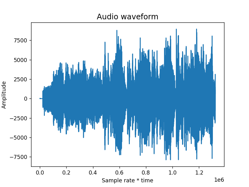
Almost everything in nature has been associated with some or other kind of sound (audio). There are various types of sound present in nature, some of them we can hear but some of them we can’t. A human can hear sound in the range of 20 Hz to 20 kHz. Image shown in the side shows the plotting of audio data in matplotlib.
Working with Images in Matplotlib
Matplotlib is not a full-fledged image processing tool for image manipulation and other image-related information. However, you can use matplotlib to visualise images that too only of PNG format and not any other, natively. Certainly, with the help of other Python library like a pillow, you can work with images other than the PNG format.
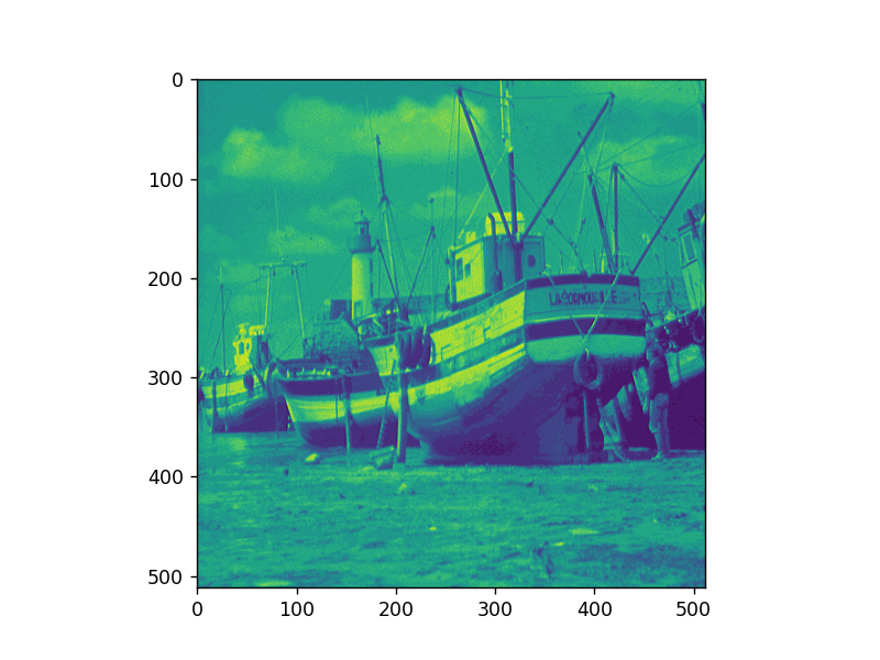
It can read a PNG image (either grey-scale or coloured RGB), load, visualize and also extract the channel (in case of RGB image). Various pseudo colouring can be applied on a specific channel of the image. Additionally, there is various predefined colourmap that you can apply to the images. Image is shown to demonstrate the handling of Images by Matplotlib.
Conclusion
You now know about Matplotlib and how helpful it is to visualize any type of data be it 2D, 3D, Linear, Non-Linear and several other.
In this tutorial, you have learned,
- Install and setup matplotlib along with all the dependencies
- Import matplotlib in Python program
- Use pyplot, an essential module inside Matplotlib
- About various plots such as XY, Scatter, Pie chart, stacked bar chart, 3D plot, Audio data, Images
- To work with Time series data, Audio data and others
You know, Matplotlib library is Just Huge !!
Learning Resources for Matplotlib


Download the PDF file with the Code and output

What a brilliant piece of writing. Although it’s short but whatever is written is simply amazing. I didn’t know about matplotlib but with this single post, I can say – I know Matplotlib and what it can do . Thank you so much for all your hard work.
Great content
Hello there! This article couldn’t be written much better!
Looking through this article reminds me of my previous roommate!
He always kept preaching about this. I’ll forward this post to him.
Pretty sure he will have a very good read. Thank you for sharing!